

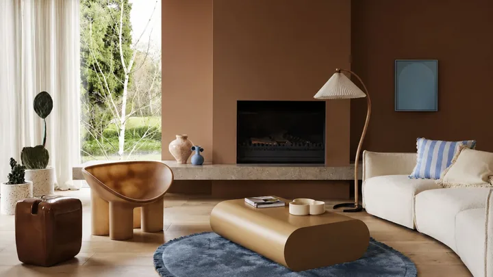
Design trends come and go, but it’s well known in design circles that, in troubled times, we’re drawn to the comfort of warmer hues. Dulux colour specialist Davina Harper says, “We’re seeing a strong shift towards emotional reconnection, with ourselves, with others and with nature. We’re also craving a sense of safety and using our homes as a space to reassure us. As a result, many people are gravitating towards colours that feel warm, comforting and familiar. These hues help create spaces that feel welcoming and restorative, bringing a sense of calm, reassurance and wellbeing into the home.”
The new neutral
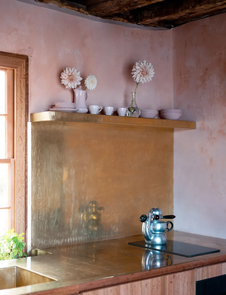
Grey had its moment as the go-to neutral hue, but in recent years, it has fallen out of favour. The tones once celebrated as icy-fresh and contemporary are now considered detached and clinical. Resene colour consultant Meryl Southey says, “Today we are thinking more about how our homes make us feel, not just how they look. There is a growing desire for colours that bring warmth, comfort and a sense of wellbeing.”
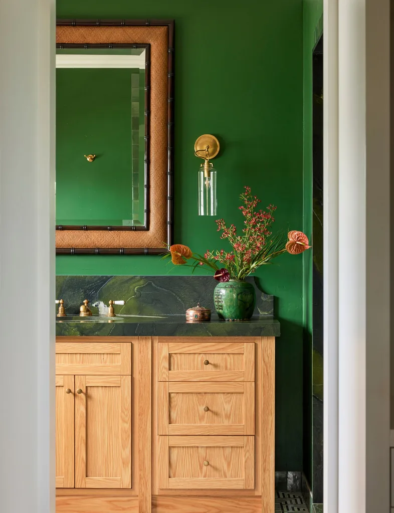
Instead of grey (or its spectrum neighbour, cool white), Meryl says, “We are seeing a move towards colours that feel more natural and grounded – warm whites, gentle greiges, earthy greens and clay-inspired tones.”
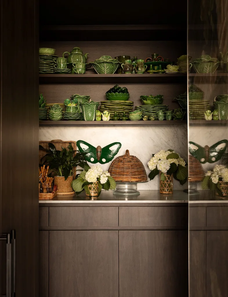
“Introducing subtle contrasts such as dusky blues, muted greens and softer pinks can bring freshness and depth, preventing warmer palettes from feeling too heavy.” – Meryl Southey, Resene colour consultant.
Brown
Brown has a new PR team and it’s marked an overhaul in the way we see this hue. Gloomy ’60s schemes of mission brown timber panelling and shagpile carpet have no relation to modern browns, which have been rebranded in edible shades of chocolate, caramel and cappuccino. Our rediscovered affinity for brown has a lot to do with psychology. In our search for comfort in a chaotic world, brown interiors are as soothing as a warm hug and a hot Milo. Brown also has versatility in its favour. Use it in a pared-back interior for a warm take on minimalism, or as a rich backdrop for a maximalist scheme. The ultimate neutral, brown can play with almost any colour palette, from jewel tones to earthy greens and muted blues and provides a grounding base against busy patterns.
If you’re ready to take brown for a spin, mid-tone browns that lean towards tan or feature earthy pink undertones are especially popular, bringing a cosy, grounded feel to living spaces, bedrooms and studies. “Brown works particularly well on walls, cabinetry and joinery, creating a natural sense of warmth that suits both contemporary and classic homes. I’d embrace using soft brown as an all-over wall colour,” says Davina.
Still not convinced? Reframe your view by looking at brown-based natural materials. Think tan leather, walnut wood, rattan, bronze lighting or a chunky chocolate wool throw.
Burgundy
A hue rooted in tradition, burgundy is unquestionably a bold choice. It also has trend-transcending appeal, conveying a vibe of old-world luxury and colour confidence.
For best effect, go all or nothing – burgundy is no support act. Colour-drench a room for an immersive burgundy experience, leaning into this colour’s moody nature. “A burgundy colour-drenched room with walnut window and door frames and a parquet floor would be spectacular,” says Shontelle Coley of Rume. “Add leafy plants and a dark yellow statement armchair, and you have a rich, moody and sophisticated space.”
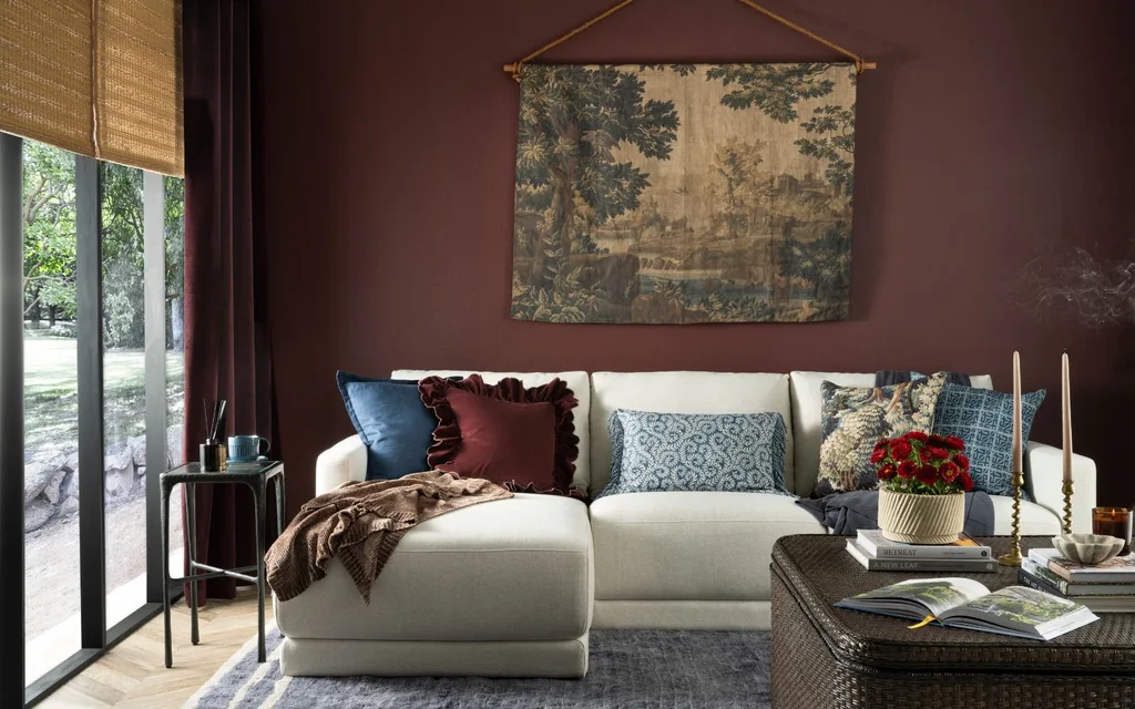
Burgundy is also a heavenly match with ice blue (a trending hue from the other end of the temperature gauge), or sage green. Generally speaking, keep the contrast low; burgundy is at its best paired with similarly deep hues, along with dark timbers and burnished brass accents.

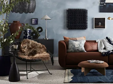
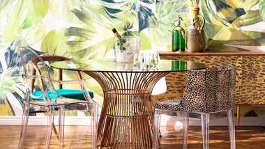
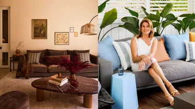
Cream is a suitably rich, old-money companion. “Just don’t bring white into the room – this would completely change the mood,” says Shontelle.
Some rooms are an obvious fit for burgundy. Use it in a study or living room for a snug library vibe. It’s also a timeless choice for kitchen cabinetry, and the perfect base for the country mudroom of your dreams.
Yellow
Closer to butter yellow than a spring daffodil and not as energetic as zesty lemon. The modern take on this cheery hue is an earthier variation: soft, calm and grounded. It has the same warmth and optimism, but the yellow we’re loving now is gentler, creamier, a little muddier and easier to live with long term. Taken to the walls, the yellow designers are using as a base neutral is closer to cream, but with the warm glow of afternoon light on a hay field.
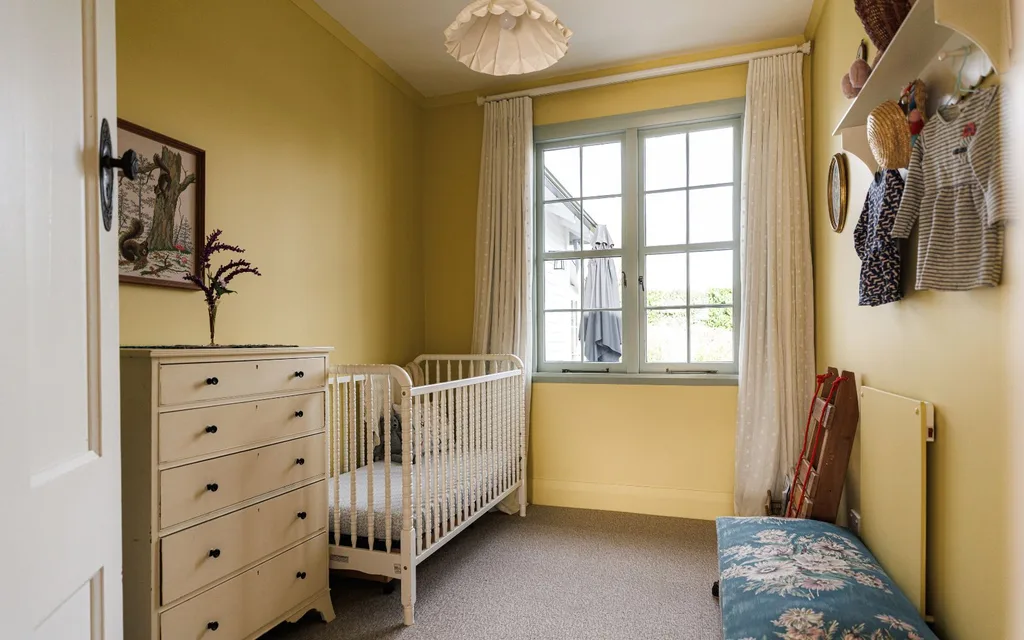
Even a little yellow can have transformative power in a room. Used as an accent colour, it magnetically draws the eye with an uplifting effect. Yellow can provide balance and a hit of sunshine in a cool-toned space, but a more modern use of the hue is within a similarly warm scheme. “Imagine a modern statement armchair upholstered in a warm dark yellow, sitting within a room colour-drenched in terracotta or dusky rose pink,” suggests interior stylist Shontelle.
Terracotta
From ancient Egypt to Mediterranean rooftops, terracotta is a material – and a colour – that predates the very concept of design trends. This heritage hue is never precisely out of style, but the difference now is how broadly designers are embracing it. Terracotta is appearing everywhere from plant pots and floor tiles (the obvious classics) to walls and soft furnishings, and in every colour variation, from chalky pink-toned clay to burnt sienna. Choose your spice level and use it as the base for a warm, grounded palette.
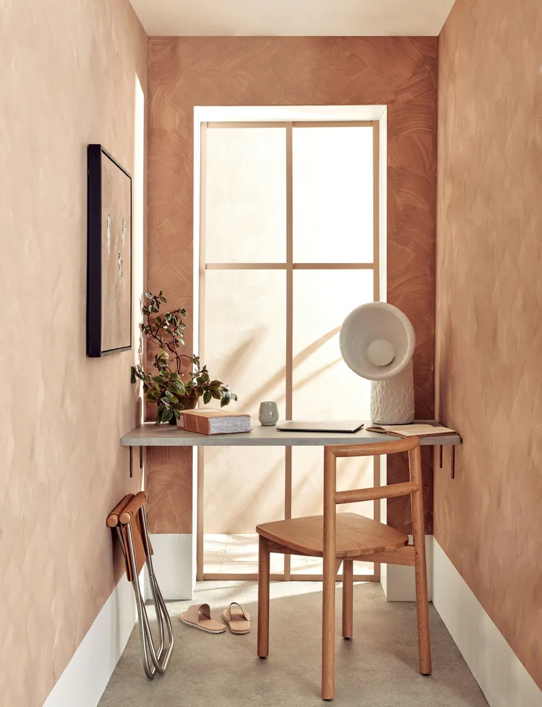
Rather than a flat wall colour, give a nod to terracotta’s ancient origins. Apply texture with a limewashed effect, introduce the colour in a red-ochre kilim rug, or in the classic form of unglazed tiles. Not just for Mediterranean homes, interior designer Nicola Ross says terracotta tiles are “a versatile choice across a variety of homes, from mid-century mosaics to more character-style homes with larger-format textured finishes”.
The quintessential sun-bleached Med colour palette pairs terracotta with the creamy tones of linen and travertine. But personality is the watchword of modern interiors, opening the door to unexpected pairings, like terracotta and pale blue or sage green.
Olive
The progression of olive from antipasto plate to must-have wall colour is driven by our need for nature. The principle of biophilic design is to connect buildings with nature, thereby fostering a sense of wellbeing. Olive is a beautiful way to achieve this sense of natural connection, delivering calm and balance, but also strength and sophistication.
Nicola describes this versatile green as “a moody neutral. It is such a chameleon and works in light and dark spaces. From full-colour rooms to accent colours, it can work anywhere”.
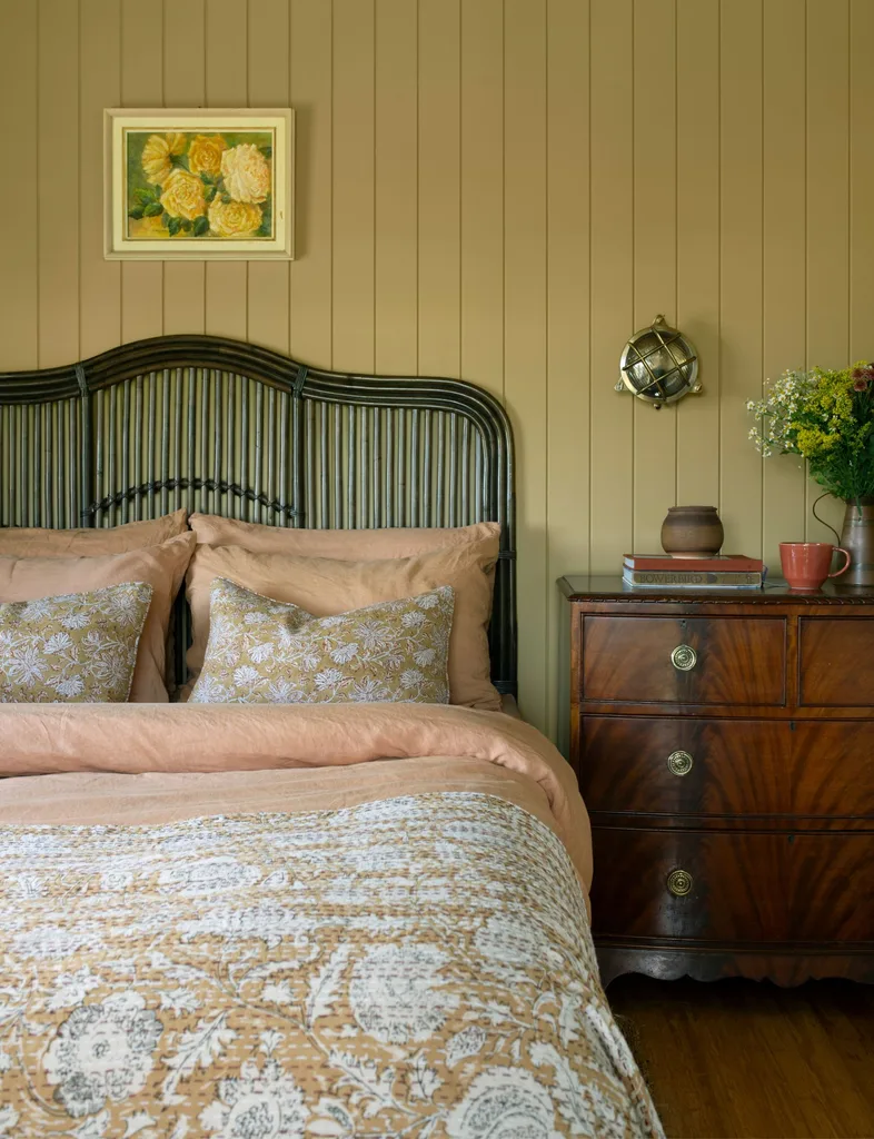
Olive works on virtually any surface, from kitchen cabinets to sofas and bedding and is delightfully cocooning on walls. “Including texture is a good way to give dimension – we use textured wallpapers and fabrics,” says Nicola. “The texture is a bit of a cheat code to ensure it stays looking good over time because there’s nothing worse than seeing every mark on a darker shade. Introducing texture gives it more usability and lifts it from being a block of colour.”
Meet your match
Choose the on-trend warm colour that best pairs with your decorating habits.
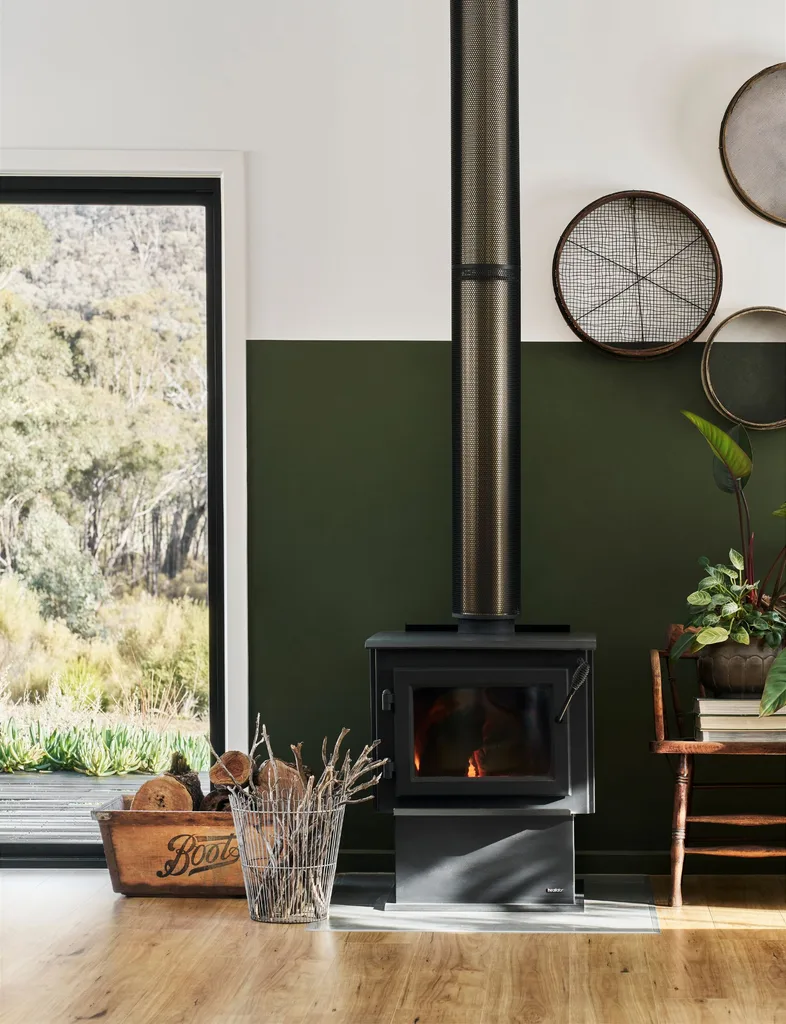
The nature lover: Try olive
Green is a must-have hue for any landscape lover and Mother Nature offers an enormous spectrum of options. But where olive green stands out from the rest is in its innate sophistication – it’s nature-inspired, but not obvious about it.
The Scandi fan: Try brown
If hygge were a colour, it would be an embracing shade of brown. Scandi design has always embraced earthy tones and natural materials and brown slides right in. Keep the classic Scandi look by pairing warm brown with simple, uncluttered styling.
The maximalist: Try burgundy
Burgundy is one for the bold decorator, but it’s also a versatile colour to play with. Shontelle says, “Burgundy lends itself beautifully to layering rich colours, textures
and pattern, which is where I think it really comes into its own.”
The country aficionado: Try yellow
If you love a farmhouse look, your Pinterest board is probably studded with kitchens in Hay by Farrow & Ball. This brand of dusty honey yellow is a country home staple, sunny but not bright, and equally suited to kitchen cabinetry or a sun-drenched sitting room.
The next-please personality: Try terracotta
This ancient material has a life well beyond 2026, but for the trend chaser, it offers plenty of room to get creative. Turn terracotta on its head by linking it with navy or charcoal, or as Nicola suggests, “If you are feeling bold go with a small terracotta tile and use a blush or powder blue grout to give a complementary colour pop.”
Shop our selection of rich, warm toned décor here.
Read next:
- Jayne Kiely’s tips on adding value to your bedroom & living spaces
- The maximalist interior design trend (and how to do it)
- The art of hygge: How to make every room feel warm and inviting


Share this post