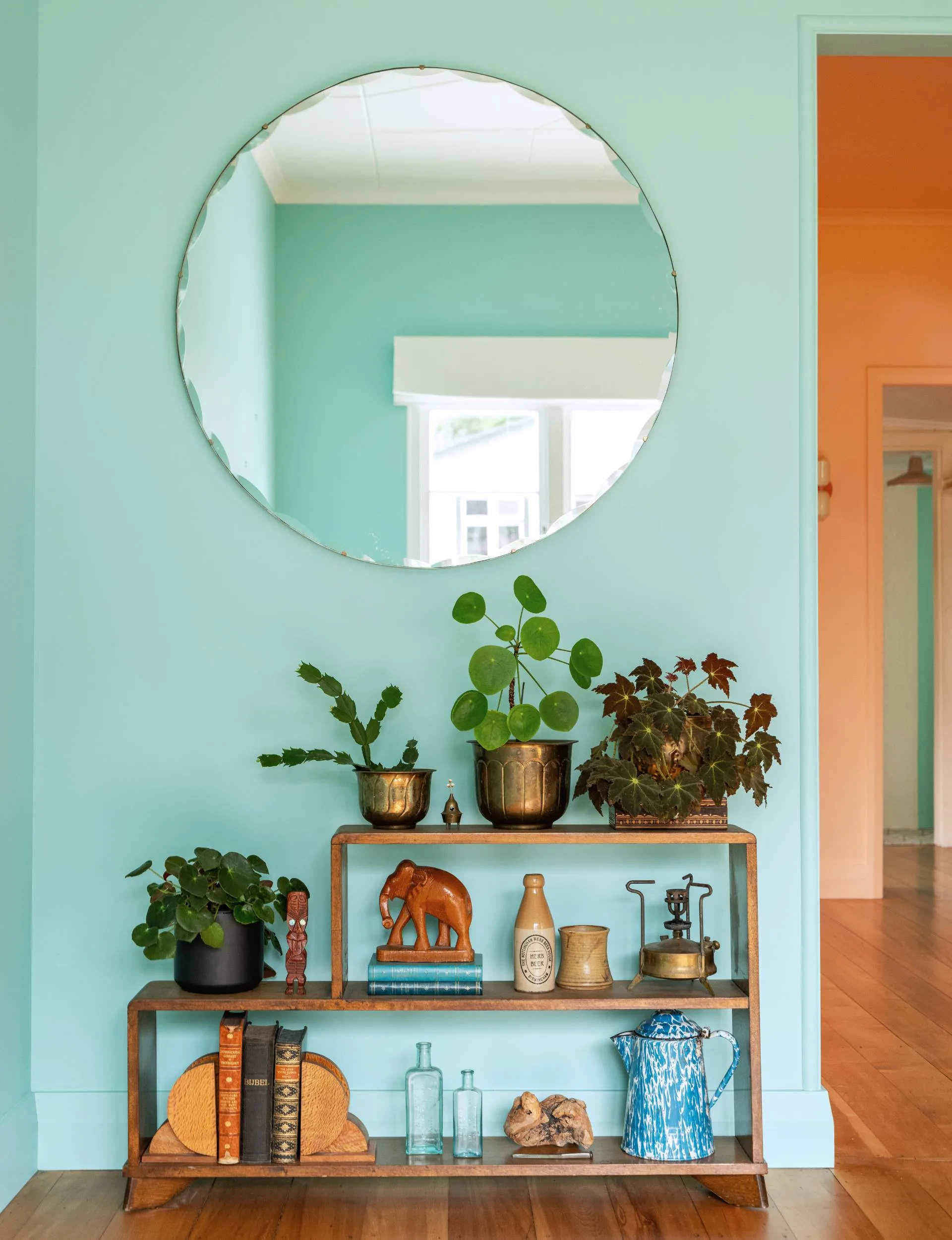
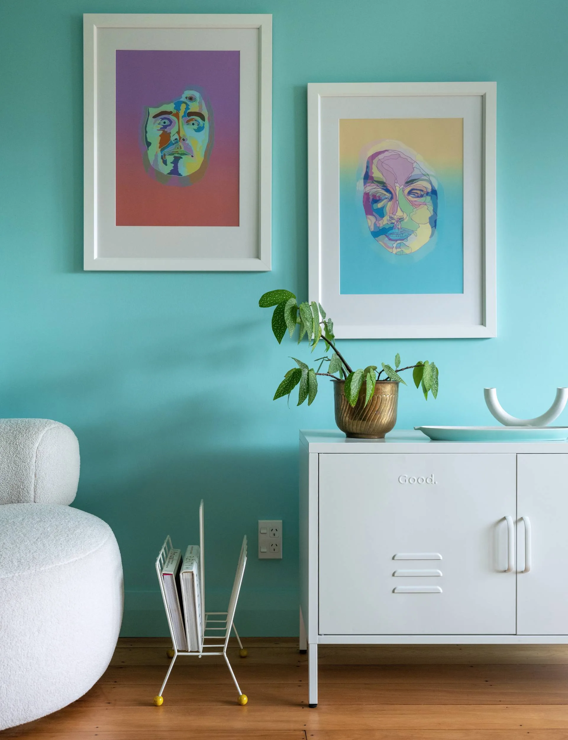
Colour beams from every corner of Ingrid and Shay Russell’s Napier cottage – on the kitchen cabinets, the letterbox, the fireplace and even inside the bedroom closets. In fact, there are 18 different paint colours in this home – but you wouldn’t expect anything less from an interior designer who studied colour psychology.
However, while this home might seem like an exuberant expression of modern creativity. Ingrid found the playful palette by looking at the past.
Characterful colour
Built in 1940 for Thora Mitchell in the final chapter of Hawke’s Bay’s art deco era. The home was modest in size and rich in charm. Its pitched roof, rather than the flat style typical of the period, makes it an architectural outlier. Originally a one-bedroom plastered cottage, the house gained a second bedroom in 1947.
In the 1990s, the owners built a hallway to connect the main home with the old wooden toolshed out back. Today, it includes three bedrooms, a hobby room for Ingrid (the former toolshed), and 110sqm of colour-drenched living.
Home profile
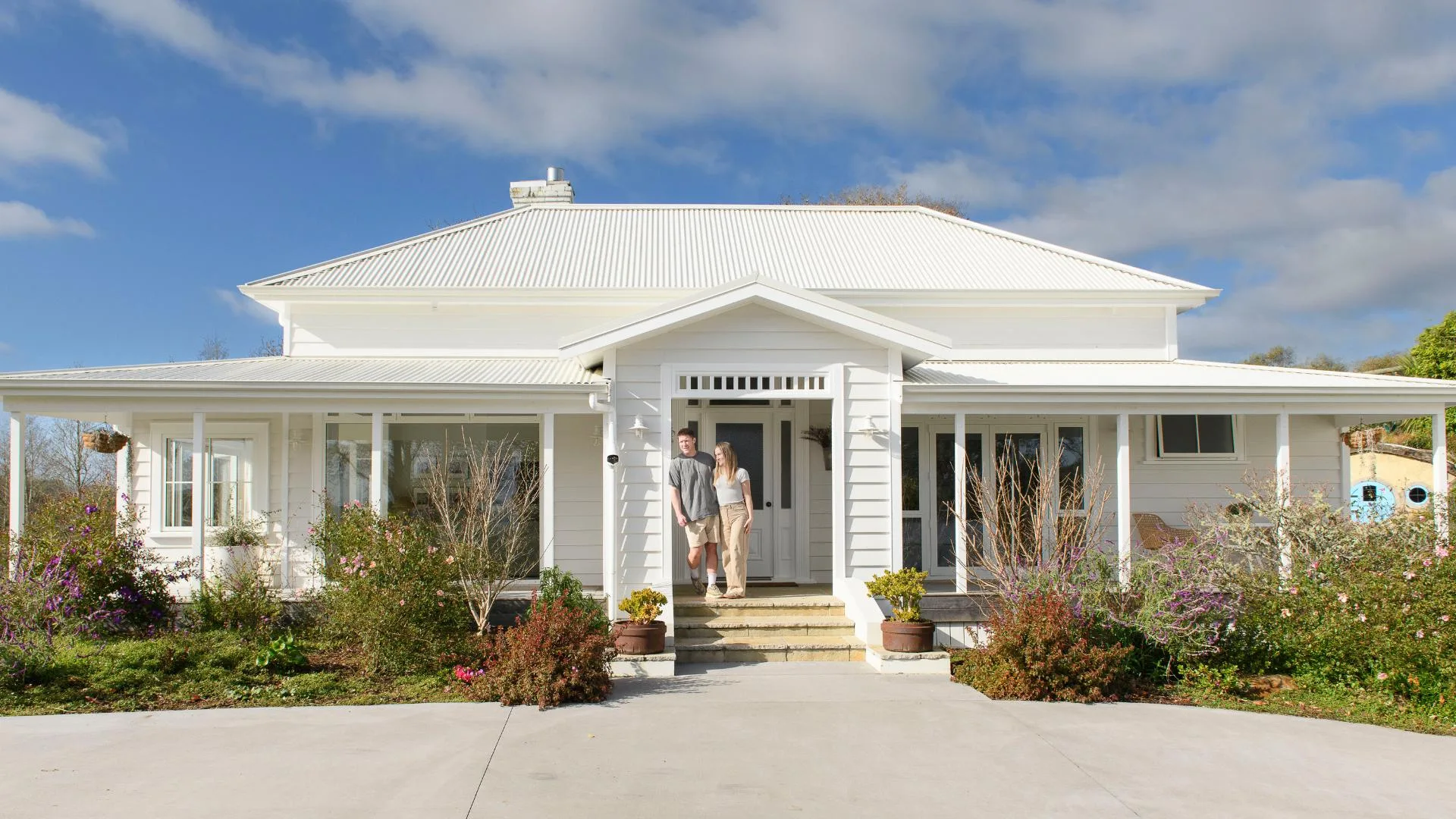
Meet and greet: Ingrid (interior designer) and Shay Russell (electrician), their daughter Imogen, six, and Bosco the cat.
The property: A 110sqm 85-year-old three-bedroom art deco-era cottage on 502sqm on Hospital Hill in Napier.
Cottage rewind
When Ingrid and Shay bought the house in the summer of 2021, decades of neglect and outdated updates had dulled its original vibrancy.
“It was cosy, but it felt like being underwater,” says Ingrid, recalling the dark periwinkle walls and black shag carpet. Even at midday, light struggled to fill the rooms.
The back garden was a jungle of ivy and fallen trees, with weeds towering overhead. As the couple cleared it, they uncovered relics from the past: fossils, glass inkwells, antique china fragments and horseshoes. Ingrid, an interior designer with a qualification in colour psychology, knew immediately that this home needed more than renovation – it needed energy.
Bold splash
“Colour has power and I use it to shift the mood of a space,” she says.
“My approach is to understand the feelings and energy that colours evoke, while taking into consideration the orientation and natural light in the room to create harmonious spaces. For this home, my concept was ‘retro meets art deco’ – the character needed to shine through in a playful style.”
Rather than follow a traditional colour wheel, Ingrid took cues from the house itself. Faded hints of pink, green, and yellow paint lingered on walls, doors and trims, evidence of the home’s earlier palette.
Of the colour wheel
“I was drawn to these colours before I even uncovered them,” she says.
“These colours complemented the house 80 years ago, and they still suit it now. It felt serendipitous.”
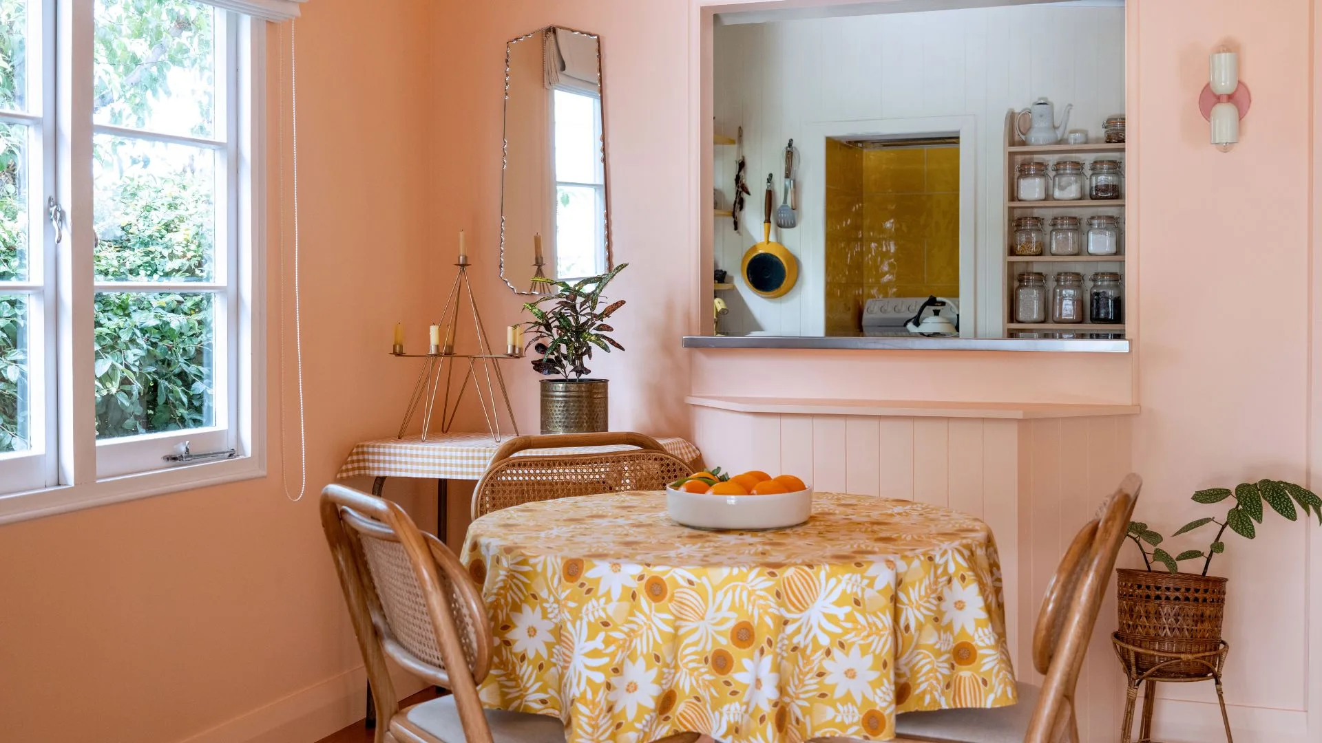
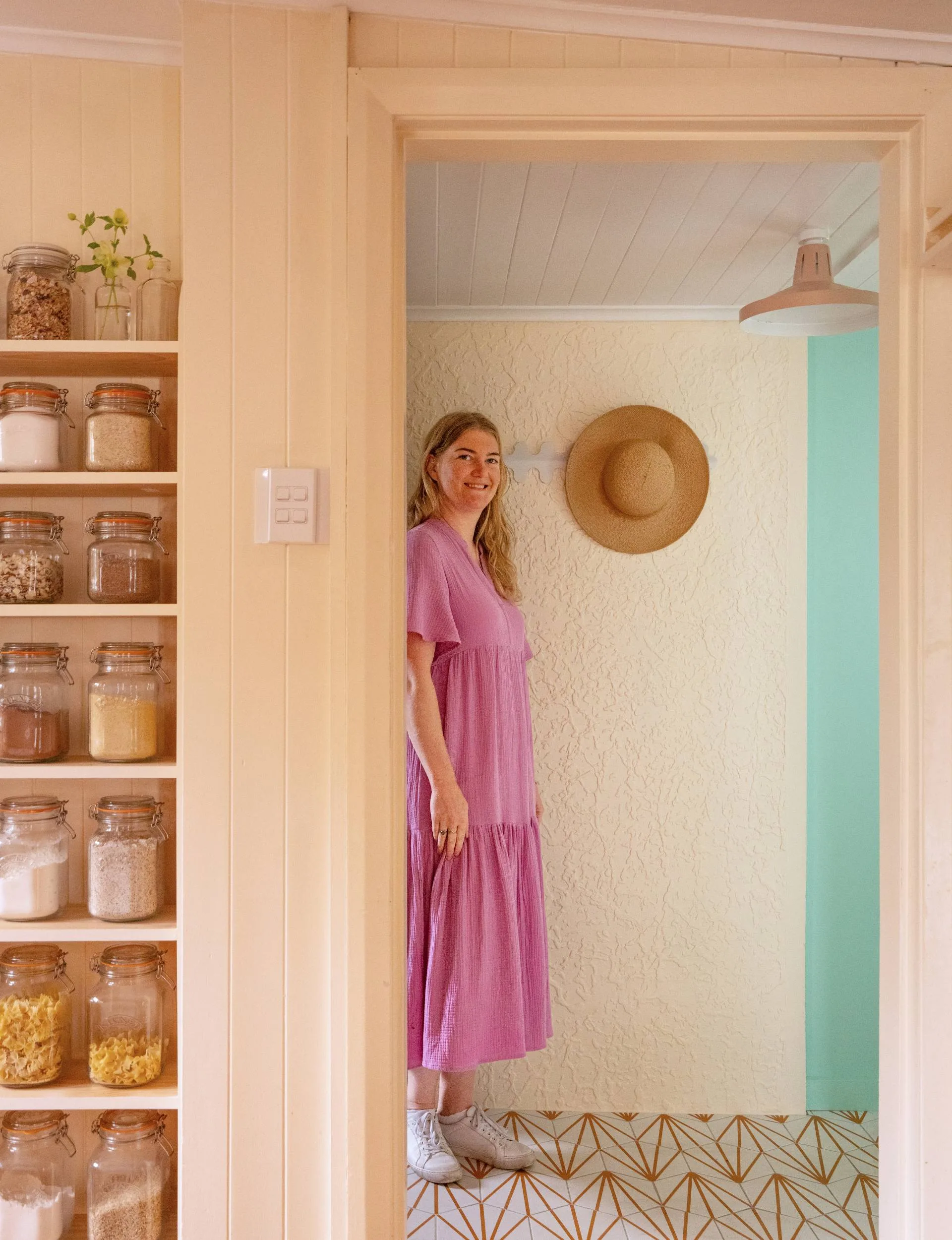
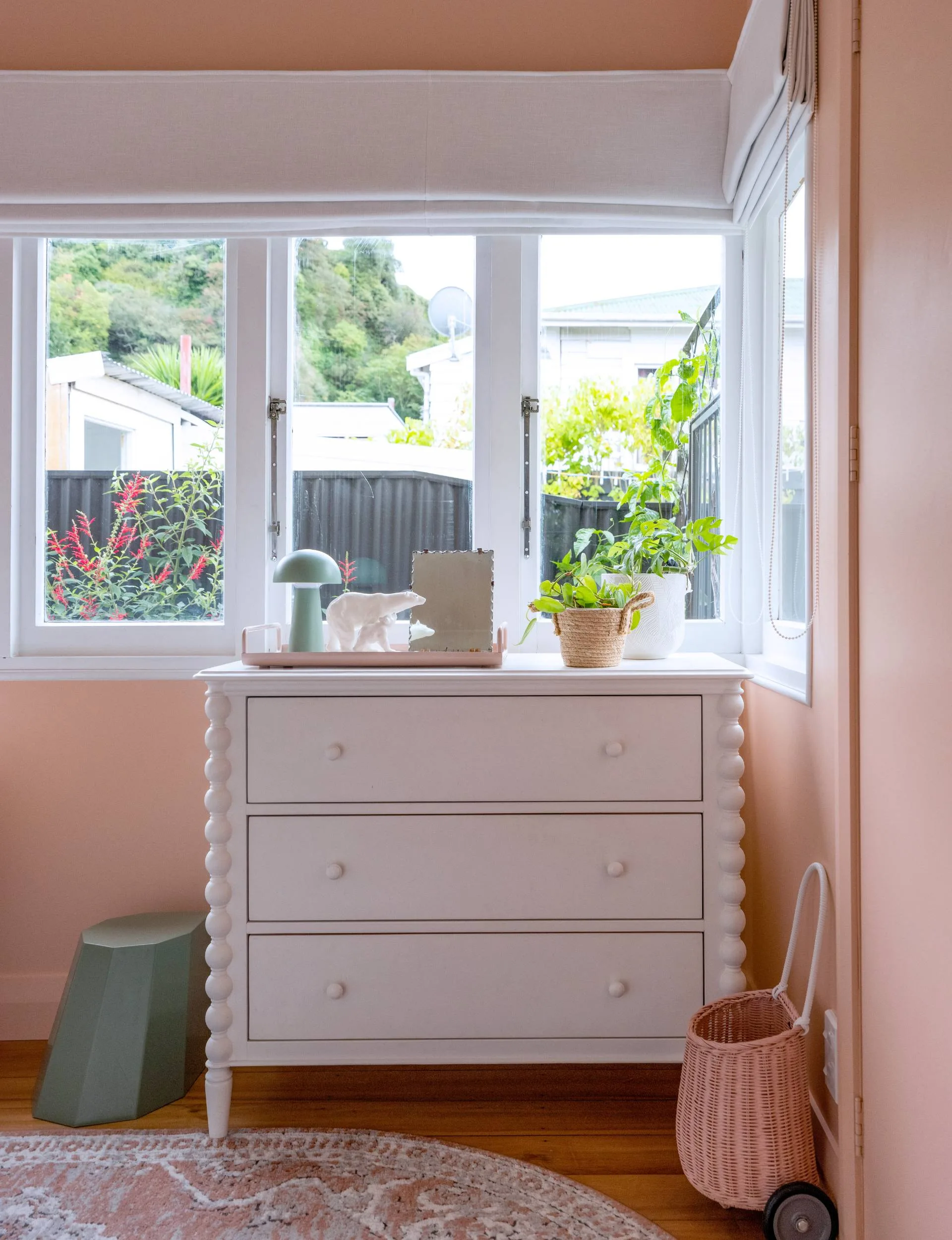
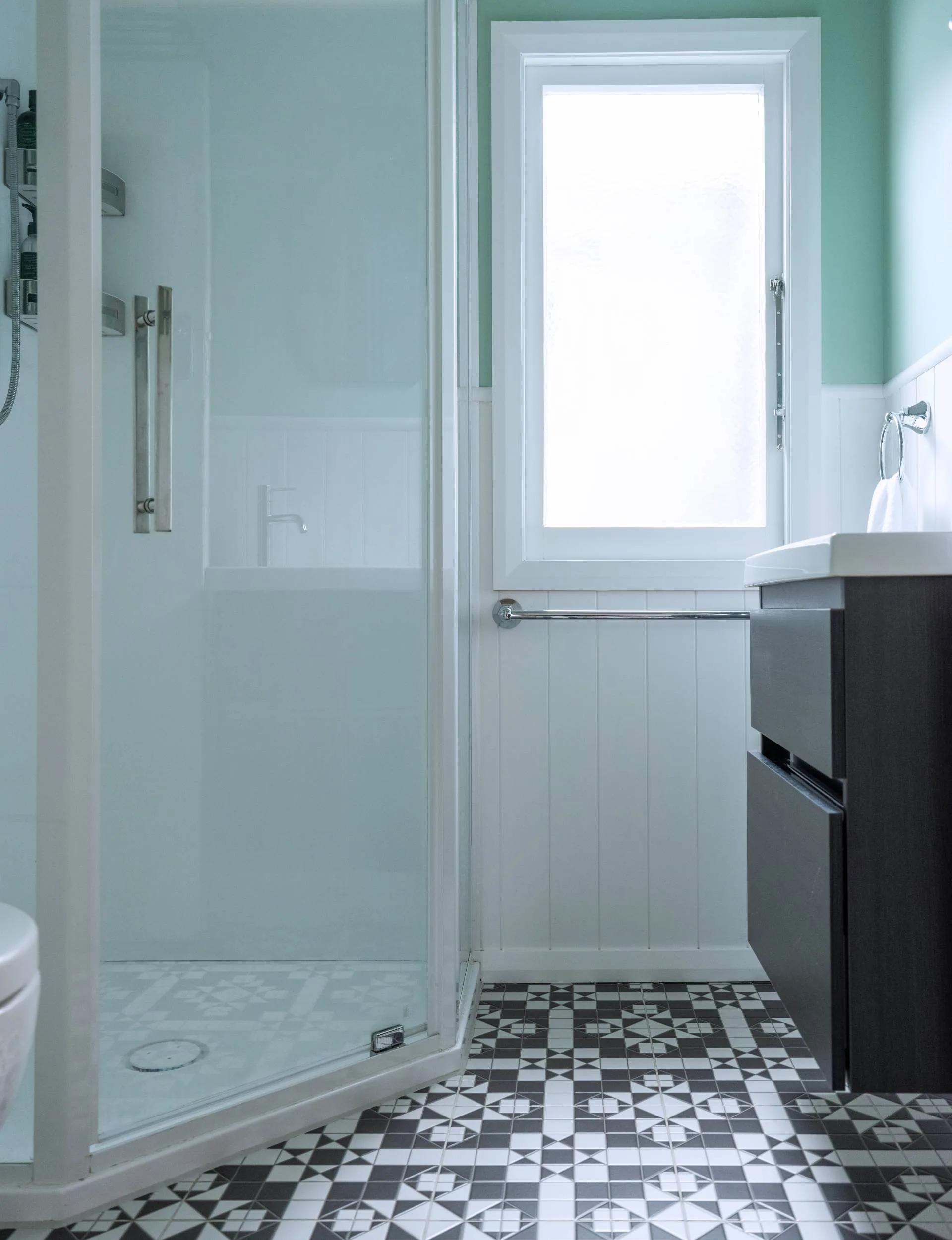
Now, each room tells its own story through the use of those 18 different paint colours. There’s the peach-toned bedroom that their daughter Imogen chose from among three options presented by Ingrid (Resene Wax Flower was the winner). A soothing soft green (Resene Gum Leaf) in the bathroom allows the geometric pattern of the tiles to shine.
“The tiles look and feel like individual geometric shapes but are 316mm squares, which were considerably less labour-intensive to install,” Ingrid says.
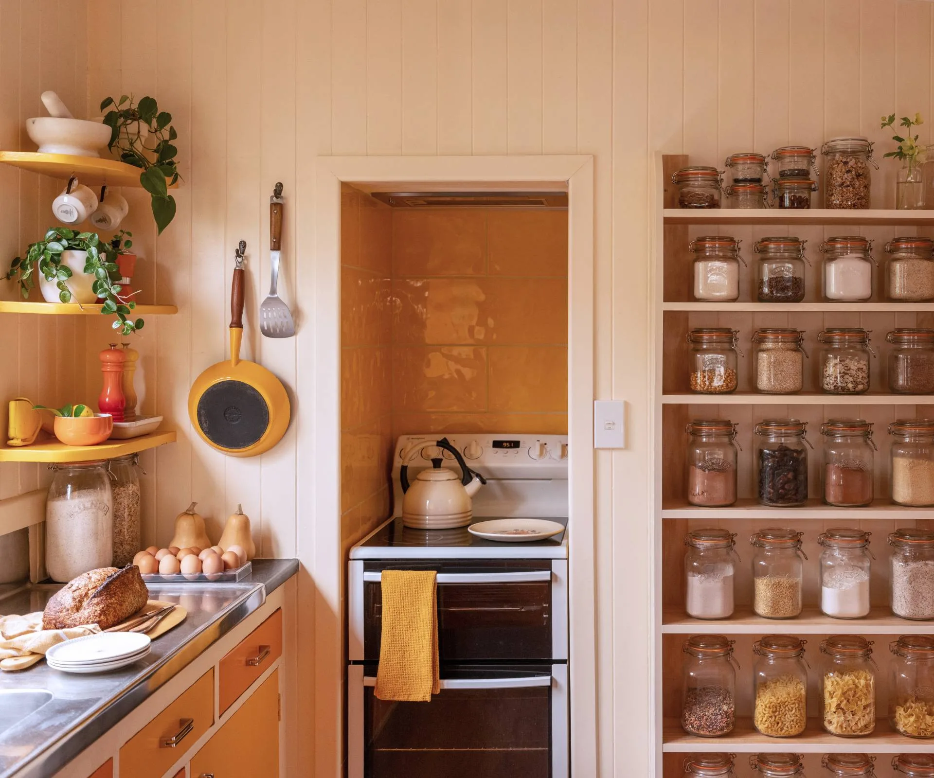
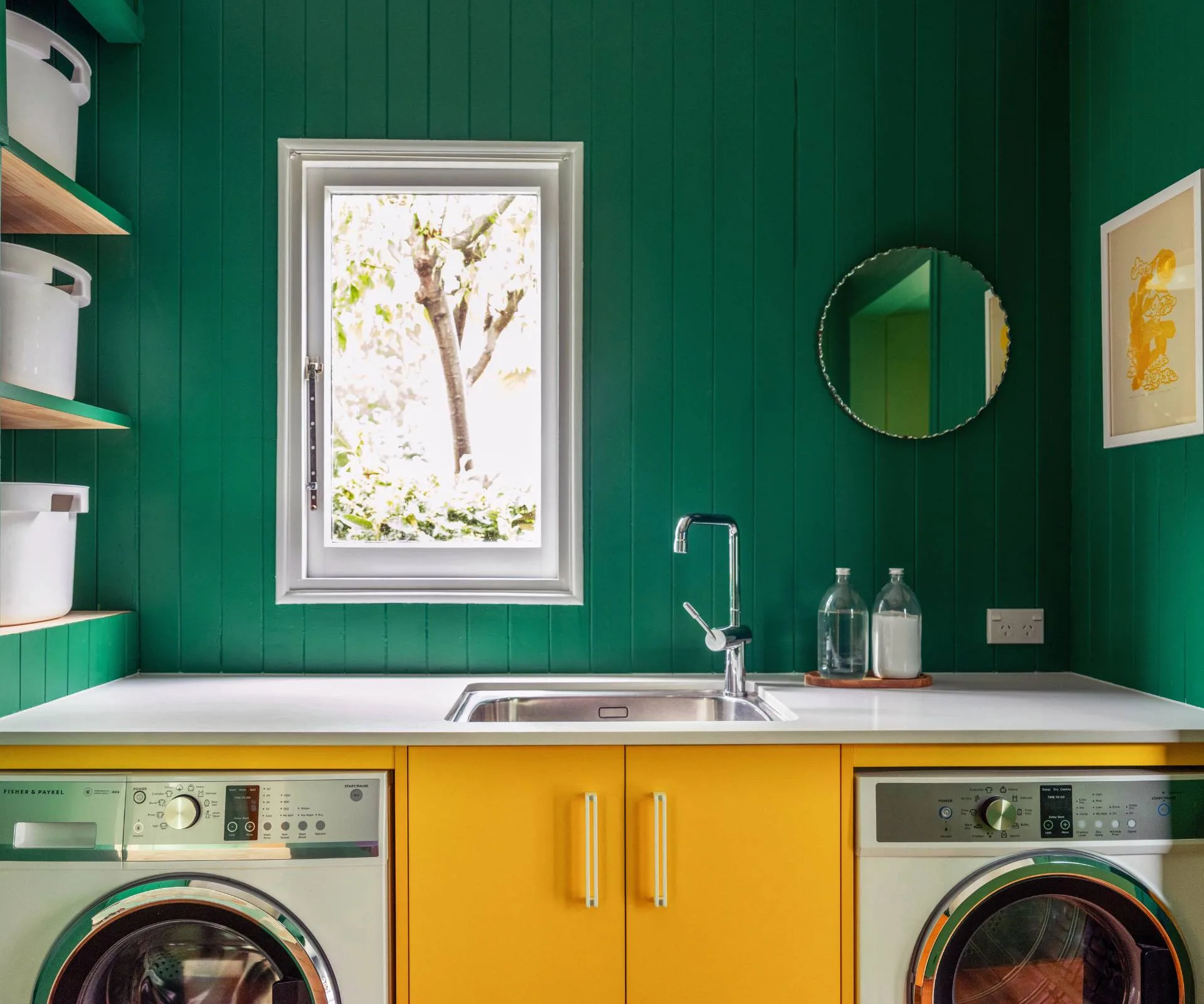
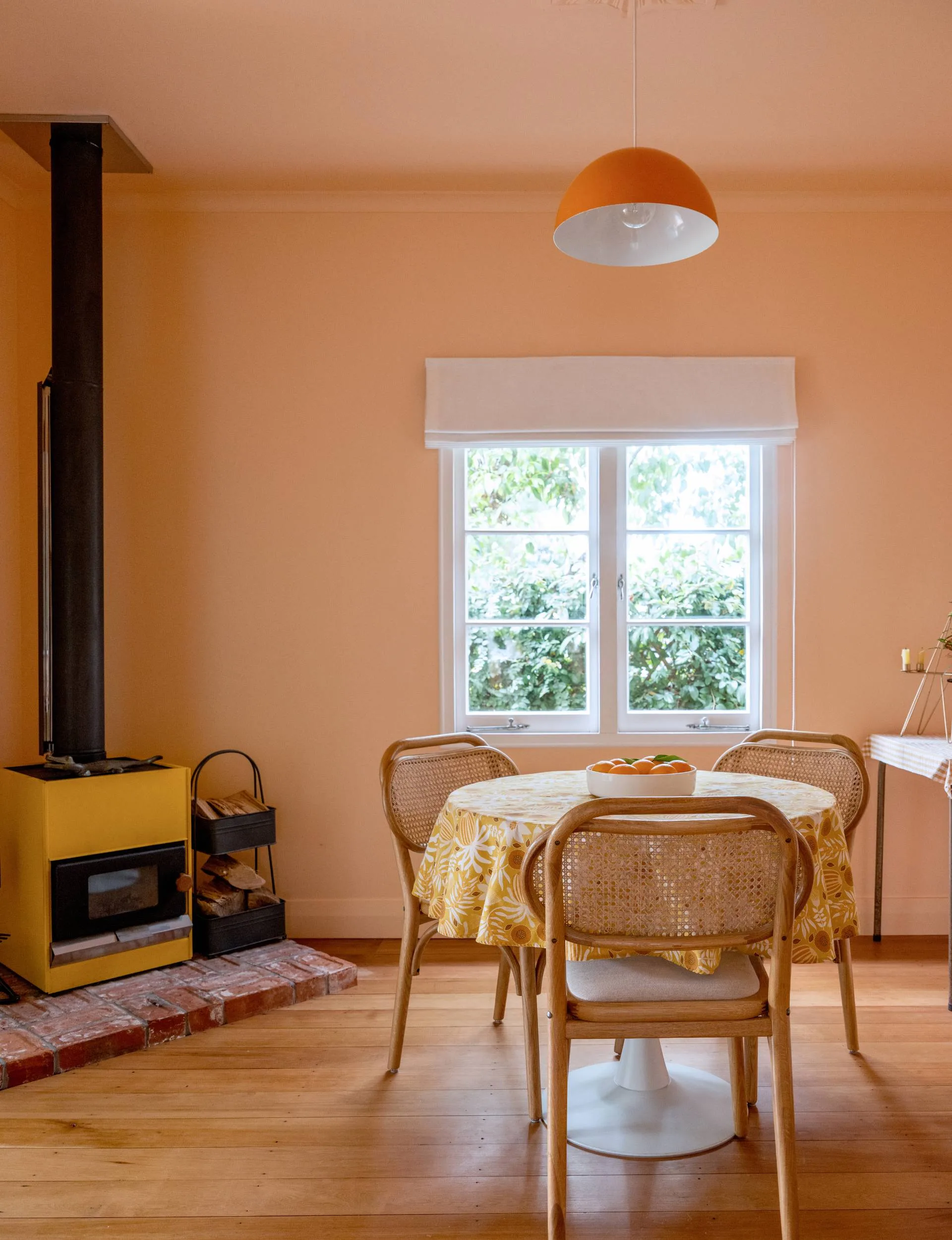
Removing the old hot water cylinder revealed that the laundry was once painted a dark forest green, so Ingrid chose Resene Crusoe as the basis for the bold laundry design, paired with Melteca Olympia Yellow Naturale cabinetry. Classic Aoraki stone benchtops add contrast and polish.
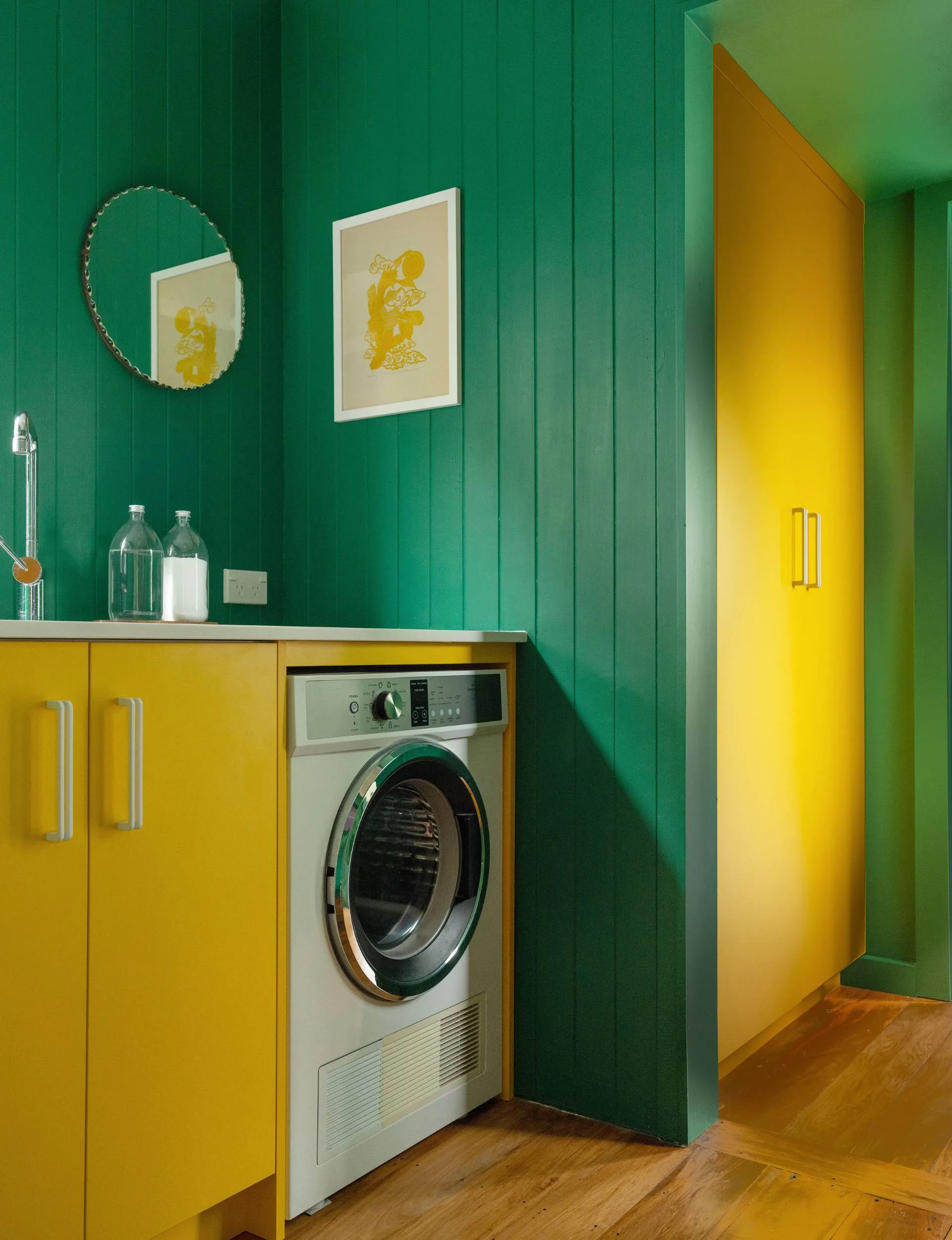
Cohesive colour
“No one had ever ordered yellow cabinets before, so they were quite a spectacle surrounded by numerous white cabinets in the Sunshine Joinery workshop,” Ingrid says.
Despite the diversity of colours, the home feels cohesive thanks to the white Roman blinds and window trims.
“To make this many colours work, it was imperative to consider the view from one room to the next. I chose to paint the bedroom and bathroom doors white to allow the eyes to rest between those areas.”
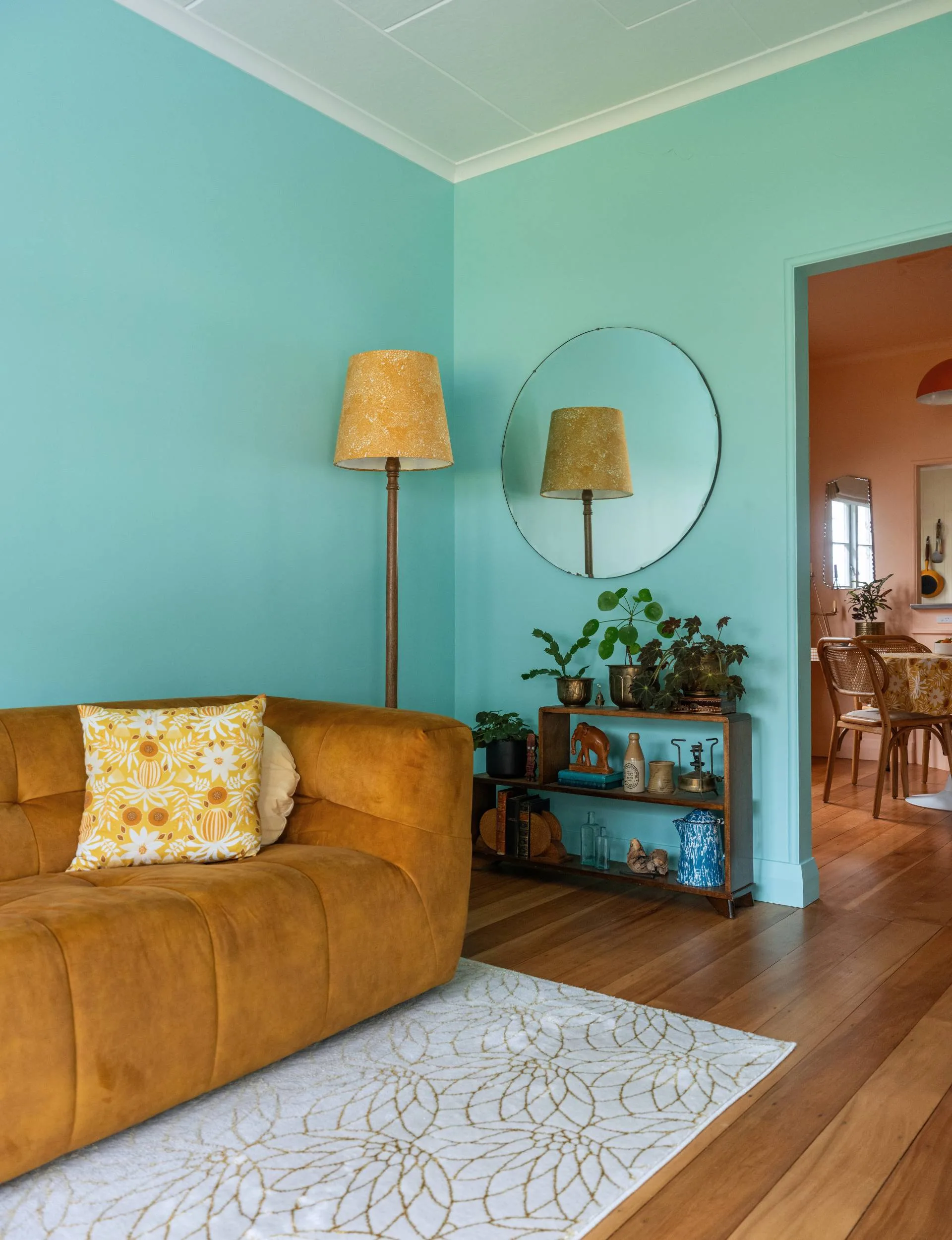
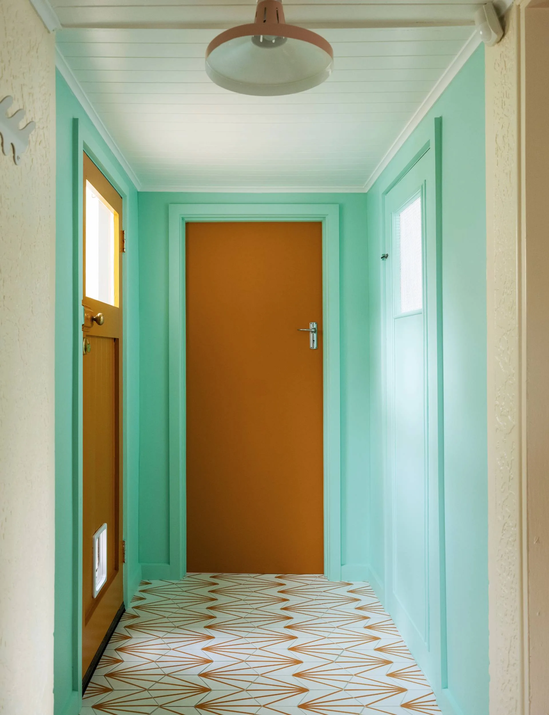
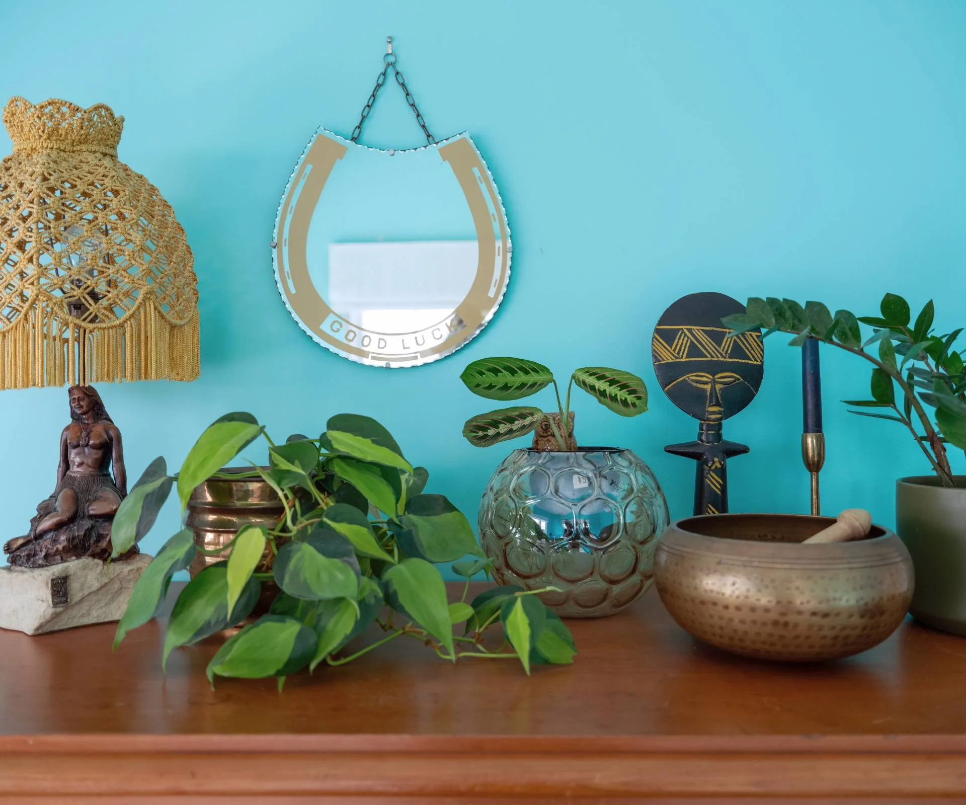
She also uses accent colours of canary yellow and cyan blue throughout the house to subtly create cohesion.
Mellow yellow
“It tells a story. Take the yellow, for example – from the street, there’s a bright yellow steel gate and letterbox. Then you continue inside to see the Dulux Yellow Gold-painted Pyro Mini wood burner. There’s also an energising pop of yellow in the primary bedroom closet, the glossy tiles behind the oven, and the laundry’s sunny cabinetry. The story ends with the back garden planted with yellow flowers and lemons on the tree.”
Visitors often comment on the positive vibes of the house and find themselves drawn from one room to the next, to see what the next colour will be.
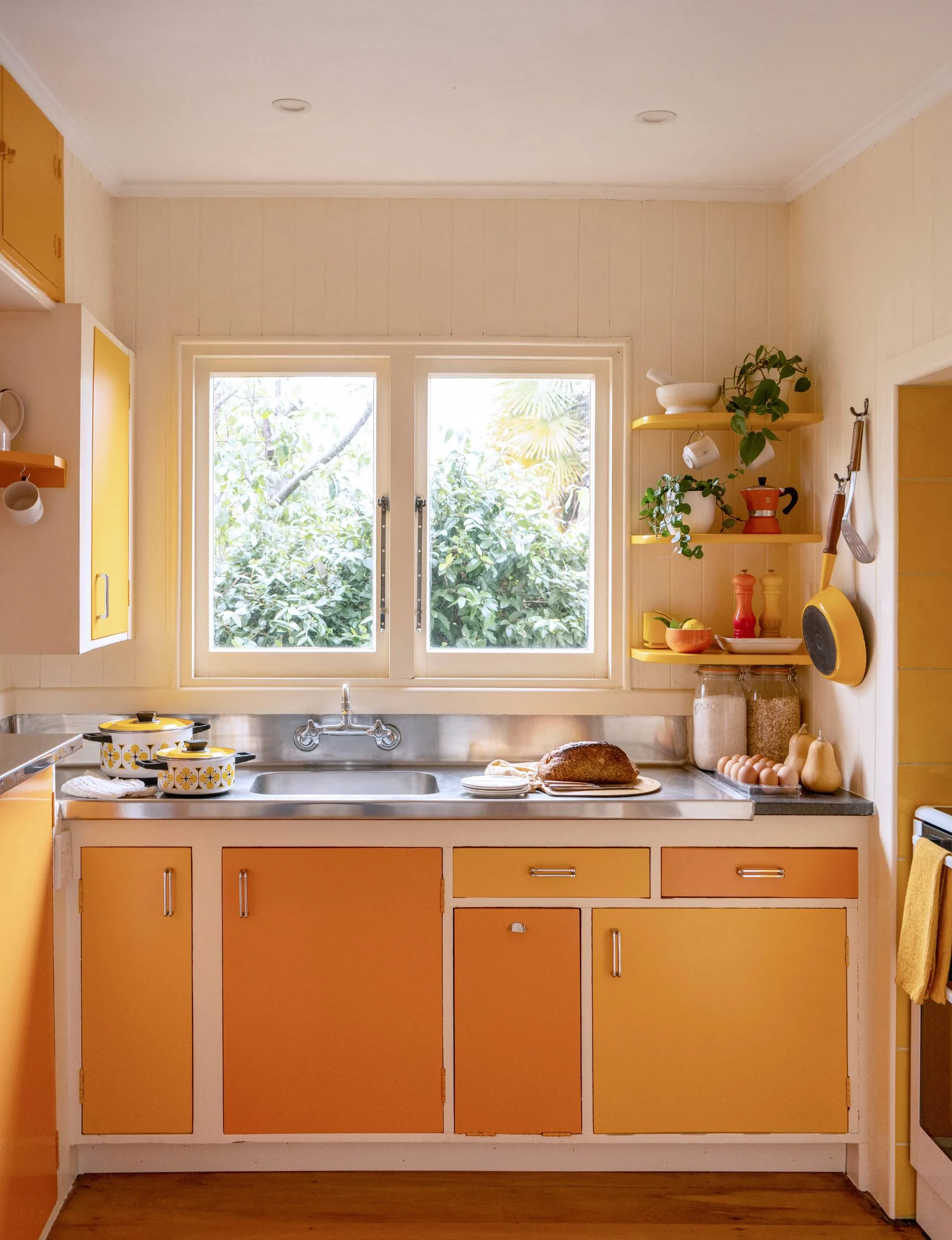
In the kitchen (still all original, including its stainless steel benchtop), Ingrid mixed up the colours on the cabinetry to amp up the retro feeling. When she couldn’t salvage the original cabinetry handles, she sourced vintage ones from Etsy and asked a local car parts workshop to chrome-plate them.
While Ingrid led the design, Shay rolled up his sleeves for the heavy lifting. He rewired, insulated, relined and painted much of the house himself. He even jackhammered through a concrete laundry floor to patch in salvaged timber from a local yard. “There’s nothing he can’t do,” Ingrid says.
“But he also works full-time, so we called in trades as needed. We’ve had 30 different tradies working with us during this renovation, everything from a bricklayer to a floor sander to a stump grinder. It seems as though there has been someone working on the property every week for the past two and a half years.”
Team effort
There was inside help, too. “Our daughter Imogen was so enthusiastic about learning about different trades. She has donned a tool belt and been a great assistant, measuring wood, painting fences and passing tools to tradies – always keen to help.”
Function remains a priority amid all the colour. They improved the original bathroom layout by adding a toilet, and the Hardie Groove walls provide practicality in the wet space while enhancing the vintage aesthetic.
The flooring throughout is native rimu, sanded and sealed with a water-based product that won’t yellow over time. In the back hallway, Ingrid chose orange-and-white hex tiles. They were inspired by the original paint colour of the step (now reimagined as Resene Mai Tai).
“It’s sloped and stepped, so three tilers turned down the job before we found one willing to give it a go.”
Garden to table
The garden, once a wilderness, is now a productive and colourful space. “We planted 12 fruit trees and a raspberry patch, all organic,” says Ingrid.
Shrubs bloom in shades that echo the interior’s palette, tying the outdoors to the inside. The renovation faced a major challenge early on: Cyclone Gabrielle. With power out and their possessions trapped in a storage unit. Shay built an outdoor stove from a stainless steel bucket.
“We cooked everything from the freezer, shared kale with neighbours, and even had a candlelit dinner,” Ingrid says. “It was tough, but it pulled the community together.”
Though the family has recently moved to be closer to Imogen’s school, the Russells have found tenants who love the house as much as they do. And while there’s still exterior painting to finish, the interior is a joyful testament to colour, craft, and the power of a well-told design story.
“It’s not the kind of place that lets go of you easily,” Ingrid says simply.
Ingrid’s three colour psychology home design tips
- Notice your own visceral reactions to colour in your everyday life. What colours do the joyful flowers you spotted on a walk have? What colour are you excited to see on the racks in your favourite clothing store? Test those colours out by bringing the flower or clothing into your space to see whether they improve or diminish the feeling in the room.
- Look to the past. Colours are deeply entwined with childhood memories. Note the positive or negative colour reactions you have – one colour might fondly remind you of your grandmother’s kitchen, while another may bring back thoughts of your school uniform.
- Colour match. If you have an item you’re taking inspiration from, such as a sentimental scrap of fabric, cushion cover, or cabinetry sample, but can’t find a suitable colour on the paint charts, Resene offers a colour match service where they will create a custom colour at their Colour Lab. It can even be named after you.
See more images of Ingrid & Shay Russell’s apartment below
Read this next:
- This Auckland artist’s home is full of her colourful creativity
- An Art Deco Auckland home that radiates colour and passion from every corner
- This 1970s Mason & Wales home has received a respectful reno, with plenty of colour
Related stories
Native ad body.

Native ad body.

Native ad body.