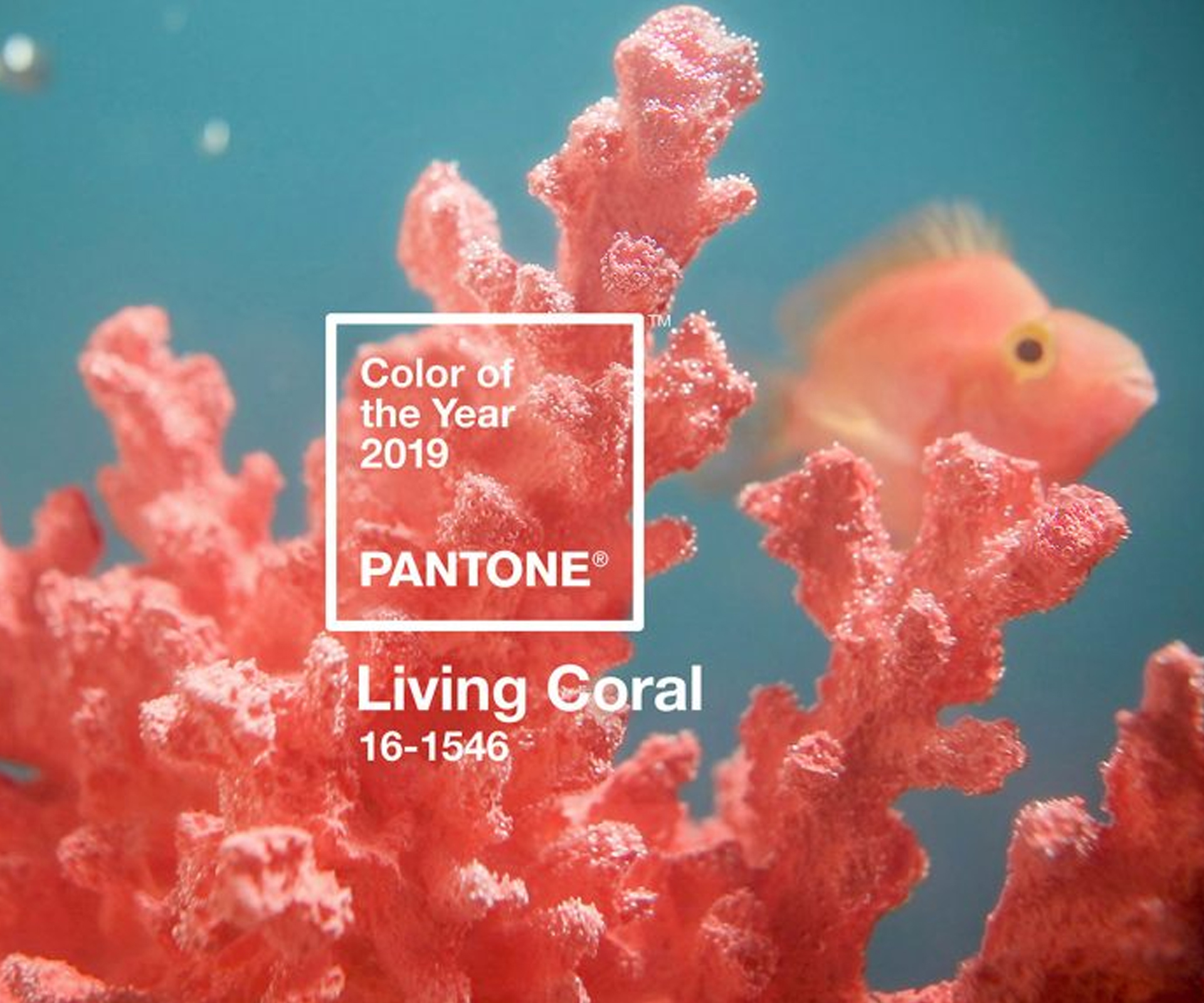
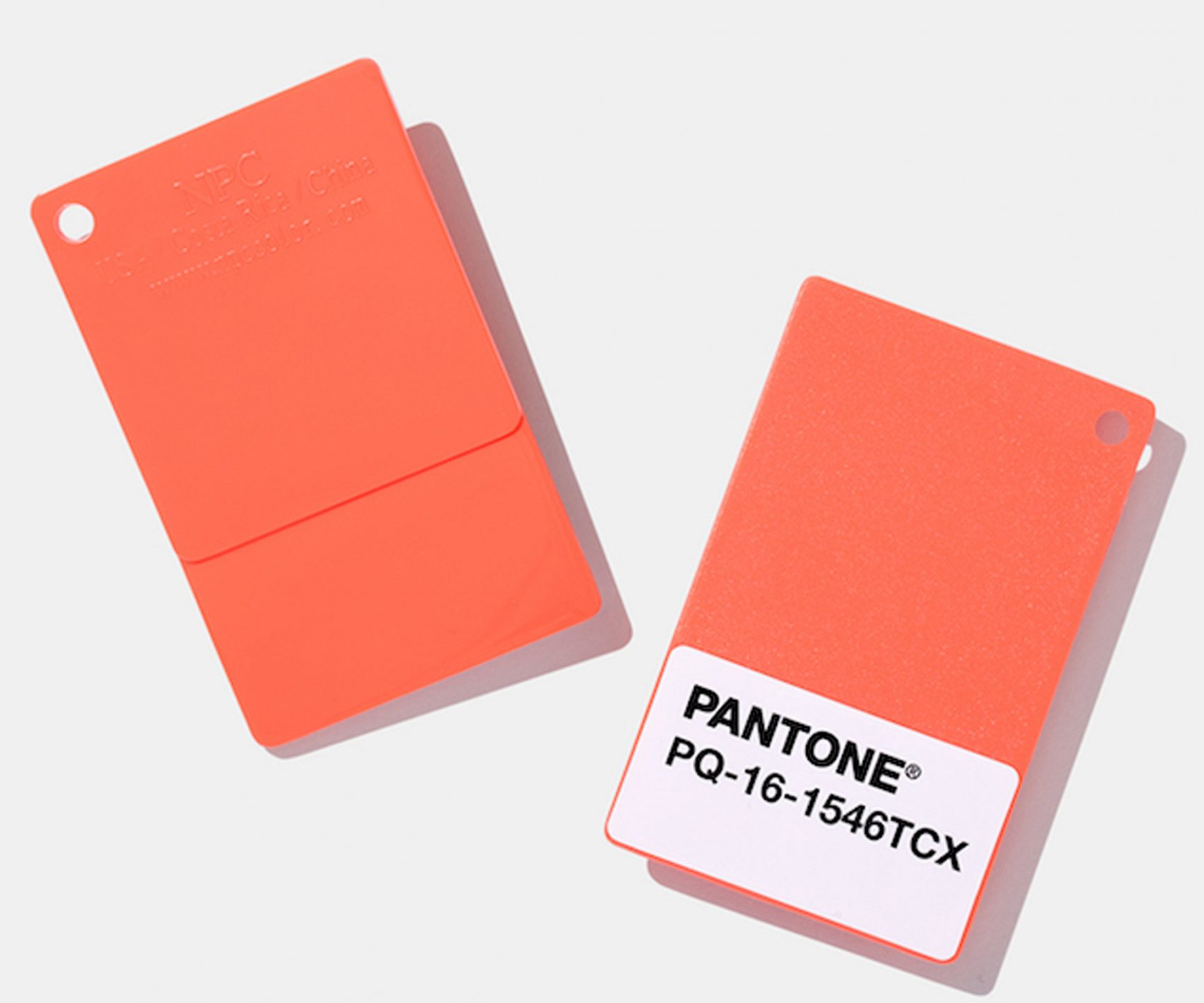
Pantone’s 2019 Colour of the Year is a peachy orange with a golden undertone. Living Coral is set to inspire optimism, energy and social connection
Pantone’s 2019 Colour of the Year will make you want to grab a paintbrush
Vibrant, yet mellow, Pantone’s colour of the year for 2019 is Living Coral. Peachy orange with a golden undertone, it’s a colour that appears in our natural surroundings and at the same time displays a presence within social media.
In fact, this colour is a reaction to the onslaught of digital technology, says Pantone. “We are seeking authentic and immersive experiences that enable connection and intimacy. Living Coral welcomes and encourages lighthearted activity.”
It’s a colour that embodies our desire for playful expression and symbolizes our innate need for optimism. Executive director of the Pantone Colour Institute Leatrice Eiseman says, “Colour is an equalising lens through which we experience our natural and digital realities and this is particularly true for Living Coral. With consumers craving human interaction and social connection, the humanising and heartening qualities displayed by the convivial Pantone Living Coral hit a responsive chord.”
The Dulux 2019 colour forecast highlighted a similar trend; a desire for intimate experiences away from social media. Davina Harper, Dulux colour specialist says, “in a time where so many of us are immersed in an isolating digital world, and with so many negative world events, there’s just something about Living Coral that feels playful, warm and optimistic.”
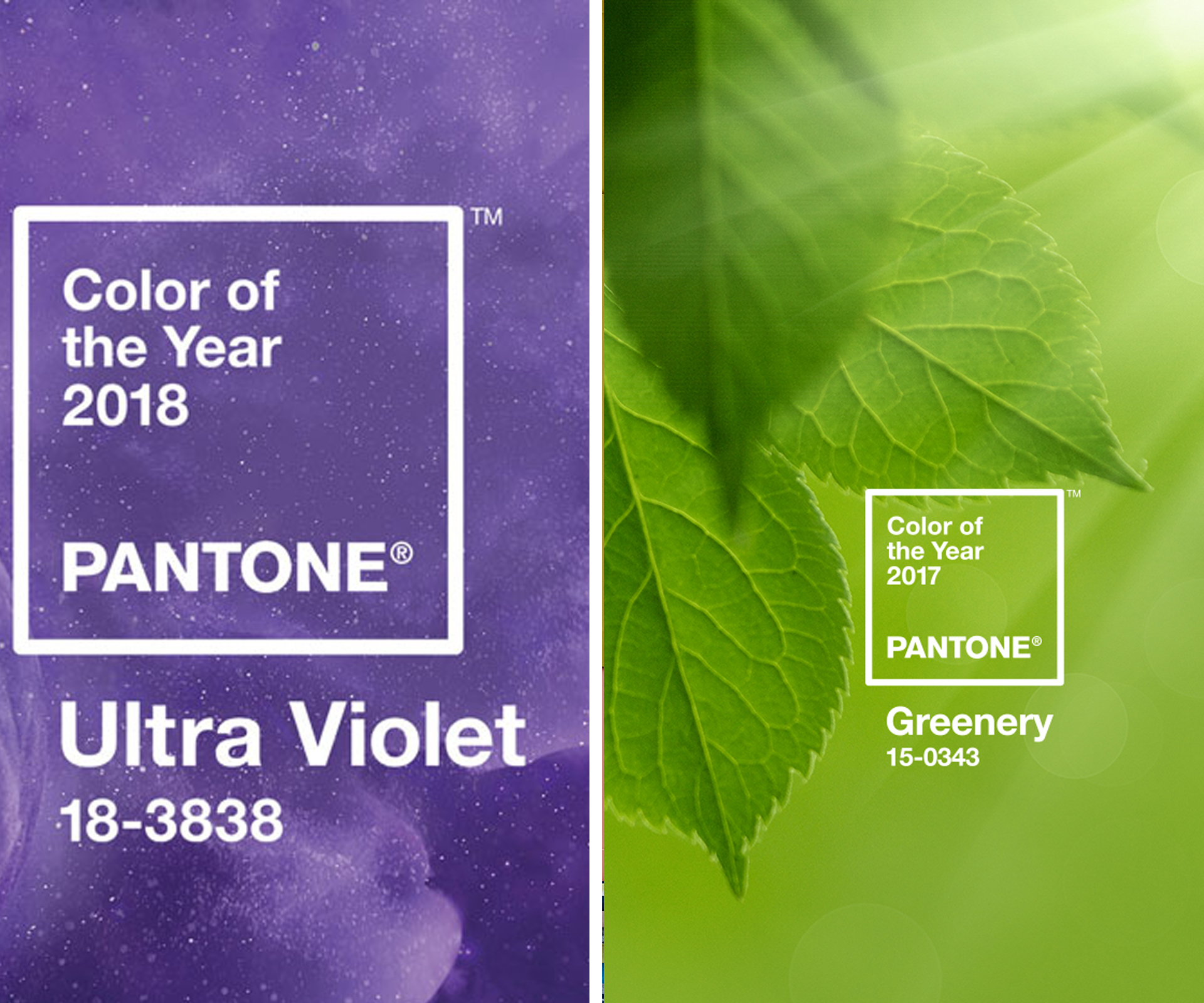
Pantone has been analysing colour influences and picking out colour trends for 20 years. Each new Colour of the Year is chosen for its relevance in all areas of life; films, art, fashion, travel destinations, socio-economic conditions, new technologies, social media platforms and upcoming sporting events are just some of the influences that help shape the Pantone Colour of the Year. This year saw the electric purple of “Ultra Violet” take up its place as Colour of the Year. And in 2017 “Greenery” was in the top spot.
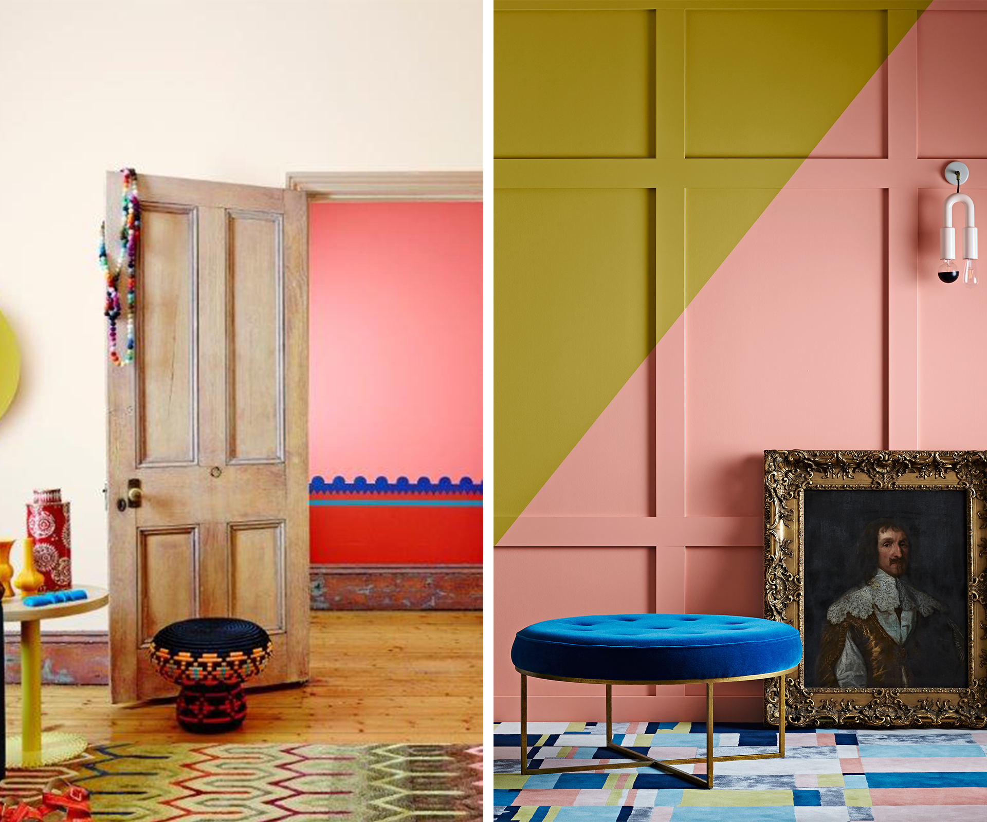
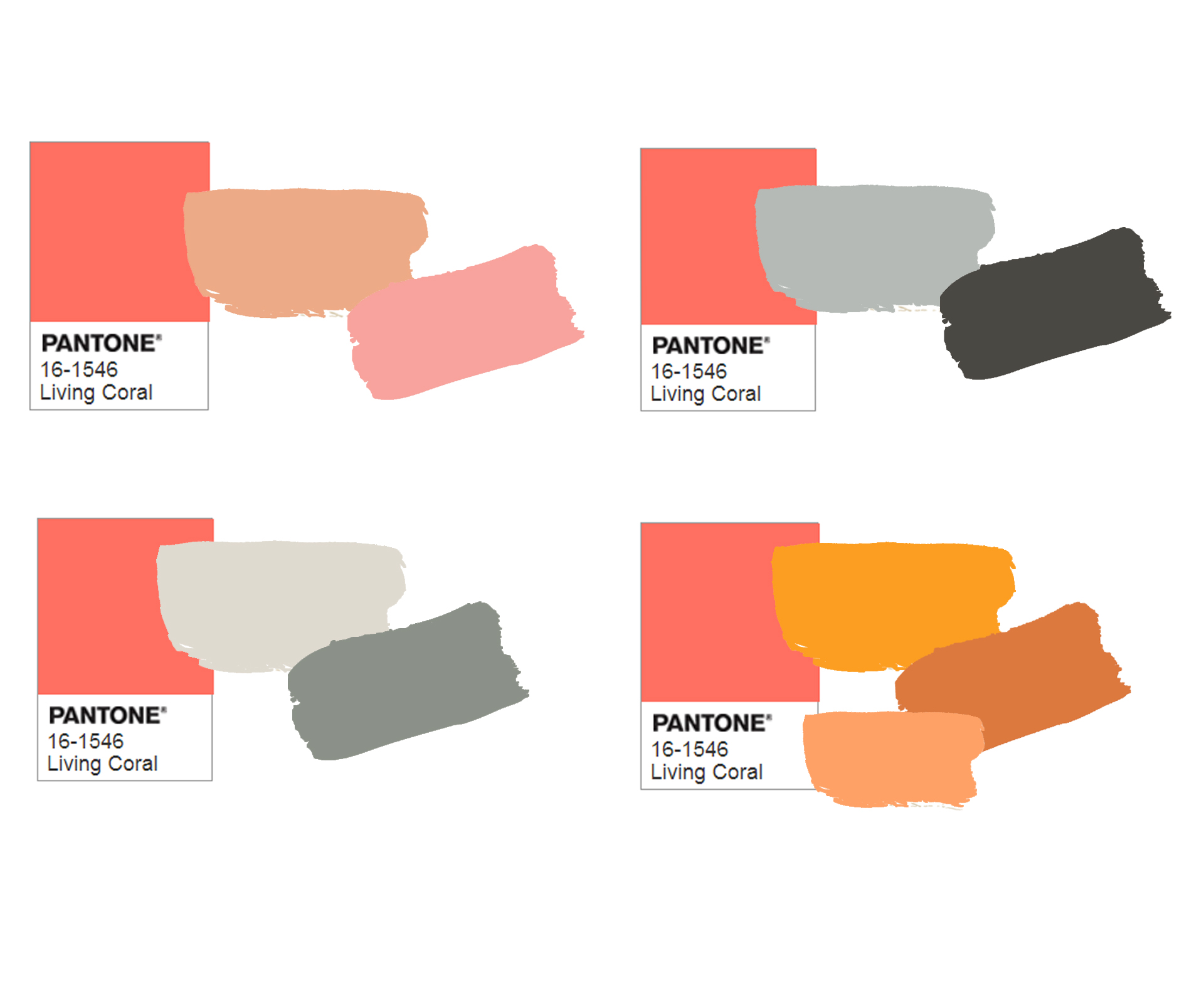
How can you make Living Coral work in your home?
With coral, a little can go a long way, says Davina. “It goes particularly well with some of the warmer whites people are now using in their homes.” She also suggests that it pairs beautifully with beige and greige.
It’s a colour that is perfect for accents. Small touches like a coral coloured blown glass pendant, a coral coloured throw or maybe a small feature wall.
Words by: Bea Taylor. Pantone images via: Pantone. Dulux images by: Lisa Cohen. Styling by: Bree Leech and Heather Nette King.
EXPERT PROJECTS


Create the home of your dreams with Shop Your Home and Garden
SHOP NOW


